Sunday, April 25, 2010

First Holy Communion, Confirmation and Christening Cards


some special cards to show you this time -

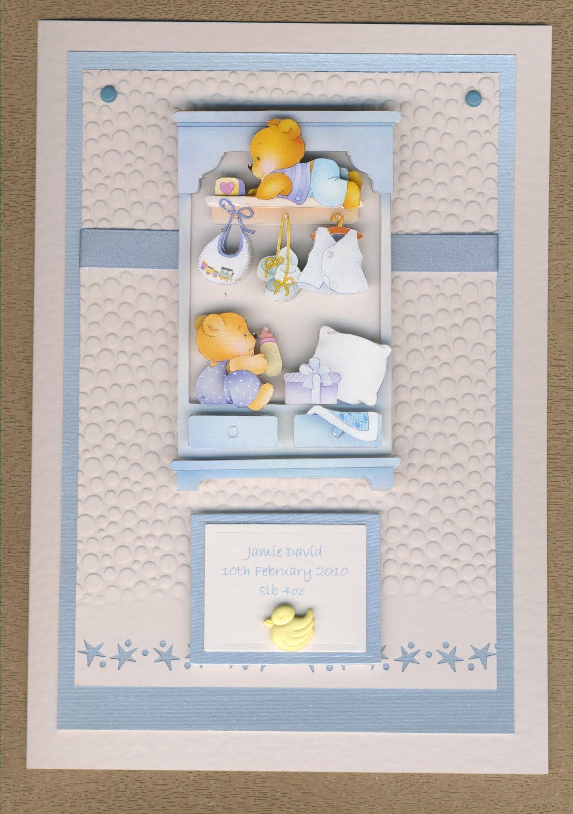
the first is a Christening card for a boy which I made with Joanna Sheen's Baby Love CD by printing the toppers onto shiny paper (ordinary shiny paper not photo paper as my printer seems to like this paper which is a good thing!)
I cut the apertures out with the deckled rectangles nestability dies and added some glue dots again.. a little ribbon and name on the front and thats it - I like these nice clean and simple designs at this time of year


the next one is for a communion and I used a stamp I have had for a while and bought from Cara Craft Supplies - you can find it here.
I coloured the image with twinkling H2O paints to make a change from embossing in either gold or silver and matching with cream or white (what I usually do with this stamp) and I think it came out nicer / a softer image by colouring it in -
also used stone grey rather than black stazon ink.
The border was done with a fiskars leaf border punch and a cuttlebug organic / leafy embossing folder on the white card with some brads to fasten all the layers together.

the next two cards I made using a bible sizzix die and silver mirri and white leather effect card with mulberry doves which were from an ebay shop if I recall.
I used ribbon for the girls card but raffia and eyelets instead of brads for the boy's one, so its not too fancy, and some partial cuttlebug embossing again for the top card layer.
the tag on the girls card is the nestability fancy tags set


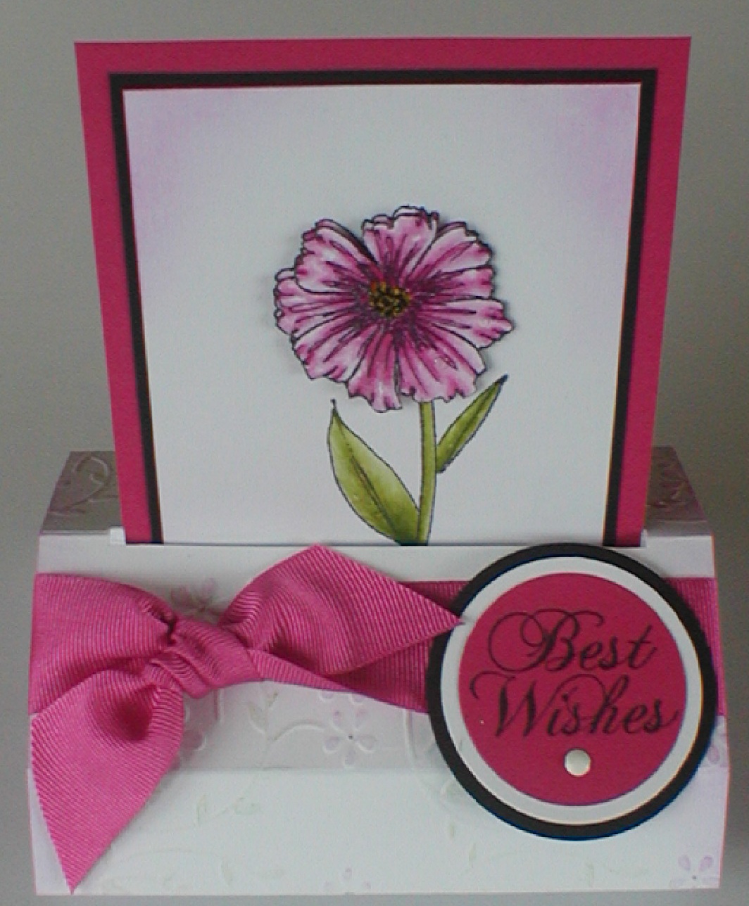
the last card on this post is a communion one whcih is slightly different to the others I have made and on this one I used a digi image and some pink petticoat papers called spring wishes.
the embossing is dome with the cuttlebug and the shape of the dress was printed onto pearlescent card before being embossed
the writing is done with paint and a calligraphy pen


and some details - sorry about the weird light in the picture but i took the photo one morning very early!

Saturday, April 24, 2010

Mens cards

here are some mens theme cards:

the first is from a Sketch over at Making it with Meslyn, which I really liked and couldnt wait to create something with - the lighthouse is a digi stamp from KLM designs (see the blinkie over on the left).
lots of distressing and inking going on with this one so it might have to grow on me as I am not sure it came out like I wanted it too - comments welcome!!
yes and thats a real shell from the beach too..
in both cards I have used the Hero Arts general sentiments clear stamps (excellent pack they are) for the 'sending warm wishes' message

and the next one is a clean 'non-distressed' version which we did in the last workshop.

the last card is made with a decoupage print, the flags were embossed with clear EP on dark card and then the border punched with the Martha Stewart checker board punch and I also used a notch corner punch on the edges.

Sunday, April 18, 2010

Anniversary and Wedding Cards

just a few spring wedding and anniversary cards to share with you.

the first one was made using a Tina Wenke stamp of a couple of squirrels who are as cute as can be -
I didnt have any colour requests or themes for the two wedding cards in this post so I just did 'my own thing'. I coloured this one with faber castell watercolour pencils ...oh and added some stickles too.


this card is a very simple and clean looking style and I decided to box it because of the size of the flower, or the depth of it rather. Royal blue and white go so well together and the sapphire element comes in when you add the gems.
Just a little embossing too with the cuttlebug border folders..


the third card is in burgundy and white which colour combo I am also hooked on at the mo (apart from lilac and mint green!) - have used this stamp before but coloured with twinkling H2O's before so for this one I used watercolour pencils again, and I like the saturation of colour of the pencils with this stamp.

Friday, April 16, 2010

and more Flowers!

just a few more cards along the floral theme- its spring so I think about sweet peas a lot as well as daffodils of course! these come from PCCrafter too and the nice thing is that you can copy and paste the images and resize to suit whatever size card you are making.
I printed these on normal matt economy card around 120gsm - 150gsm so they are easier to cu the fiddly bits AND because the image is so soft I thought pring i on shiny paper would get as nice an effect


the second card is a free standing pop up card which I saw here. Beate I just loved yours that I had to give it a go!! the stamps are from Gina K's shop set entitled A Year of Flowers designed by Melanie Muenchinger.
The flowers were painted with twinkling H2O's and the embossing chalked to give a sublte coloured effect on the raised bits
I could make these cards again and again and once you have worked out the principle and the 'kinetics' its easy to do different sizes!


the last one on the list is made with some new stamps I got from the English Stamp Company and is an oriental set.
I like soft and sublte cards but I also like the red and gold in oriental cards a lot!!
.. so this is what I came up with - a handy tip to try is when you download backing papers or buy digi backing papers, try printing coloured ones on greyscale or B&W - this paper was brown and cream but looks nice in B&W too.
the gold 'dots' are glue gun made dew drops which I coloured with gold alcohol inks in case anyone is wondering.

Saturday, April 10, 2010

butterflies

were what I was thinking about recently and I got out a couple of different stamps for these. We made these cards in the workshop yesterday so were doing a refresh or learning about distressing, 'second stamping' or 'shadow stamping' for the subtle background on the first card and colouring with different objects (used ear buds for this one) and stazon inks which mix when the two colours meet each other.

So the first card was made with a hero arts butterfly and background stamp..

...and the second using a Martha Stewart punch for the border and an Anna Griffin stamp which is a little more detailed. the powder blue, brown and white combination is a favourite of mine, so you might see if popping up elsewhere.

here is some detail too and you might see some stickles on there just makes it a little more glitzy and used twinkling H2O's to colour this butterfly

Tuesday, April 6, 2010

Baby Cards

just sharing a couple of simple baby cards done with Le Shuh decoupage - with all the stamping it was different and a change to go back to cutting - a little therapeutic in a way!


Monday, April 5, 2010

Special Birthdays


just a few pastel coloured cards (the spring weather must be hing an affect on the colours I am usiing this week - lots of white and pastels andother 'clean' spring colours).

thjie first couple of cards were made with Squigglefly Images (this one is called Dancin Denise), printed and coloured with twinkling H2O's, and also used the cuttlebug music folder which was chalked after being embossed with faber castell chalks. Used Martha Stewart punches too (cant do enough paper punching at the moment!!)


the next couple were courtesy of PC Crafter which were printed onto thin matt card and cut out as decoupage with more cuttlebug embossing.


Friday, April 2, 2010

March Swaps

just a couple of swap bits - the first one is for inchies and they had to look like a postage stamp. used Penny Black clear stamps and a little butterfly stamp i found on ebay, bit of colouring with watercolour pencils, mounted onto white card and then trimmed with postage effect edge scissors.. oh and inked the edges... again!

and the next one is made with my Penny Black tree stamp which FINALLY arrived!! yeeha.
so can use this stamp for all seasons and together with Adirondack dye based ink pads, I created a card with a 'monochromatic' feel.
the trees are stamped with the shadow stamping technique and then the trunks are watercoloured by applying the brush to the ink pad and then onto the image..

I like the quote too - think its really special and works well with the whole theme of trees..